

Using artificial intelligence in your data analysis isn’t as sci-fi as it sounds. Artificial intelligence, or AI, isn’t like unleashing the Terminator into your data set. This is more about helping people understand more from the data with less effort.
Within Power BI there are several visuals that are classed as Artificial Intelligence visuals. These visuals can be set up on reports to make the actual data analysis easier for the end-user. These tools are designed to make the data easier to look at, easier to use and ultimately deliver more value.
Let’s take a look at the visuals that are available in Power BI.
The Q&A Visual
The Q&A visual is something that allows the users of a report to simply ask questions and get visual answers. Anyone using the report can either type in a normal, or natural language, question into the Q&A box and Power BI will serve up a visual to answer the question.

Image: Microsoft
As a report designer you can use pre-built questions on this visual, or you can let the users of the reports simply type in questions. So, if someone wanted to know how much of a particular product was sold this week, or how which shop sold the most then they can simply ask the report.
There is one limitation of this feature; Power BI probably doesn’t understand the data that you’ve loaded in as well as you’d think it would without some help. Don’t misunderstand, the functionality is fantastic out of the box, but thankfully, you are able to teach Power BI more about your data, and how to interpret the questions. A little time spent doing this can have a huge impact on the users of the reports as they are able to use the feature more effectively.
You can also see the types of questions that people have been asking. This can be really helpful in understanding whether the reports that have been built are helping people in the way that you think they should.
The Decomposition Tree
The decomposition tree visual is a very powerful visualisation that allows you to visualise your data across multiple dimensions. In other words, you can drill through the data to explore how different elements are affected.
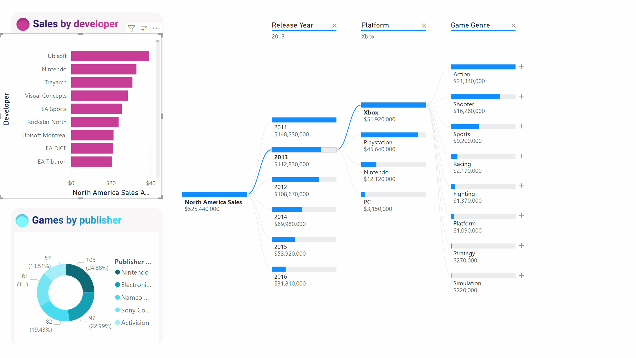
Image: Microsoft
What makes this visual interesting is that as a report user, you can ask the visual to find to drill to based on certain criteria. So instead of following a predefined path, the report can be guided by the data to find certain interesting values.
This can be really valuable when looking for a root cause of an issue when you don’t always know where to start or where you’re going to end up.
Smart Narratives
Announced in the September 2020 update of Power BI, and currently in ‘preview’ (at the time of writing), the smart narratives visual will provide commentary automatically from your report. It will provide a written text commentary of key takeaways and trends from the data, in a text format.

Image: Microsoft
This has been designed to eliminate something that I have spent many hours doing over the years. Taking a screenshot of a report, adding it to a presentation and writing some commentary. Within this new feature, you can add the narratives visual to your report and let it summarise the data for you.
The good thing is that you can edit the summary to fit your needs. You can add or change the text, the values that are shown, even calculated metrics within the visual, all of which can be formatted to your own look and feel.
Why does any of this matter?
For these AI visuals to make an impact to your reporting they need to deliver more than just simply looking good, or making people marvel at their capability. They need to deliver value back to the reporting and the analysis.
One of the main drains on time for anyone who is creating reports are the odd questions that they get, the ‘can you just’. These questions sometimes are needed, but the more self-sufficient that you can make the end users the less prevalent these questions.
For me, these tools, when used correctly, will allow the report users get answers to more of the questions that they need to answer, rather than having them ask someone else to help them, should the answer not be obviously available.
The more power that can be given to the end-users, the more they will be able to get out of the data, the more they will use the data, the more they will base their decisions on what the data is saying.
Want to learn more? Talk to one of the Sontai Team today.