
Now in its 5th Year, Microsoft Power BI has once again seen a wide range of updates coming through in each month of 2020 as there is continual improvement in the software capability for both report developers and report consumers.
So, we thought we’d end the year with our Top 5 favourite updates from the year that will affect the way people use and interact with reports. Here goes...
5. Power BI tab in Teams
Starting off our Top 5 was the introduction of a Power BI tab into Teams back in February. Little did anyone know then how important this was going to be. As the crisis took hold across the globe and people shifted into remote working having the ability to add Power BI apps into Teams meant that the new remote teams could still find and track their data in order to hit their objectives.

Image: Microsoft
4. Mobile Reporting Enhancements
In June additional enhancements were made to the way in which mobile views of reports are created. Although this isn’t strictly speaking an update that directly affects report users, it does indirectly affect them. The ability for report developers to more easily create reports that are optimised for mobile devices will mean that there are going to be more mobile optimised reports, giving report users to a better experience on the move.
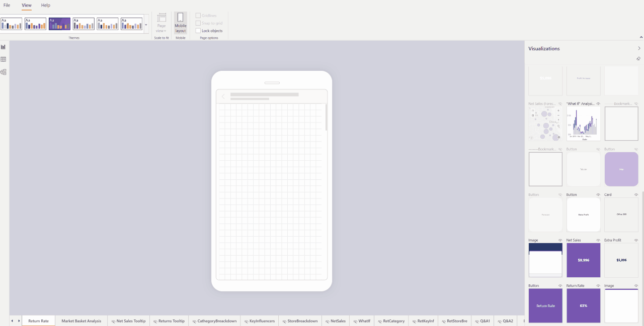
Image: Microsoft
3. Rectangular Data Point Selection
Adding the ability to select multiple data points on a visual was announced in preview back in August. This may sound really simple but is a great tool for when you want to select several points on a line chart or scatter chart, whereas previously selecting multiple items would have been down to individually selecting them. A great addition.

Image: Microsoft
2. Personalise Visuals
Announced in April, the option to personalise visuals is one of those tools that will improve the user experience of Power BI in any organisation. As a report developer, picking the right type of chart is difficult because everyone like to look at data differently and some people just don’t like certain types of charts. Giving users the ability to change the types of visuals themselves without giving them full edit capabilities helps keep control of the reports, whilst giving a great level of flexibility to anyone looking at the data.

Image: Microsoft
1. Smart Narratives Visual
Although still in preview the Smart Narratives visual has taken our top spot for 2020. This artificial intelligence visual, announced in September, provides a customisable solution that provides key takeaways and points out trends automatically with every refresh of the data. Gone is all the time that is spent writing the comments each week or month. Gone are the workarounds that have gone into displaying static commentary on a report. And gone is the frustration felt across an organisation when commentary is left off because the data refreshes too often to keep it up to date. For us, this is a real game-changer.

Image: Microsoft
If you’re interested in learning more about how Power BI can help create a data-driven culture in your business then please do get in touch with us on +353 (0) 45 83 52 83 or hello@sontaidatasolutions.com and we’d be more than happy to help.